
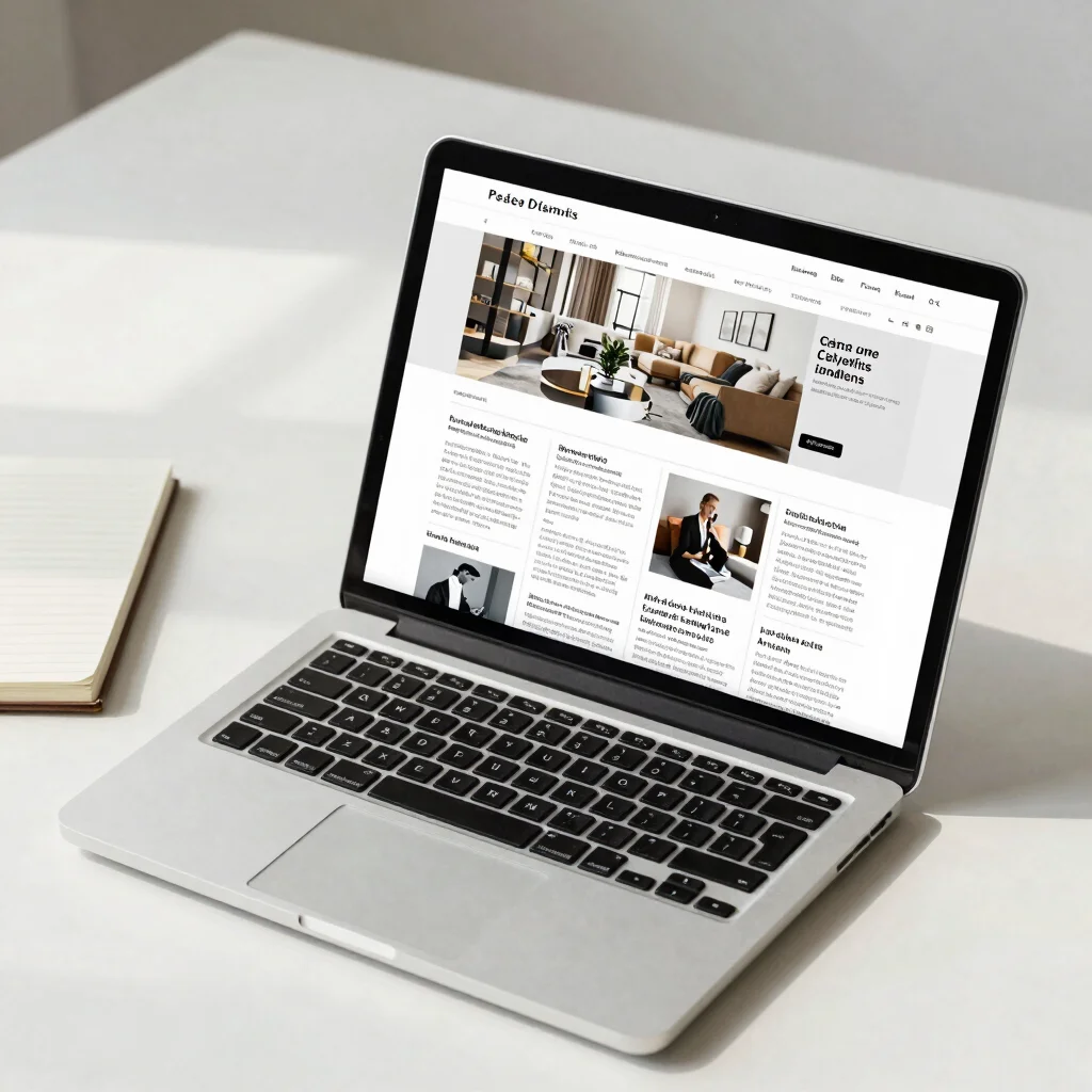
A reader lands on a homepage with a small question: where should I start? If every post gets the same-sized card and visual weight, the page offers no answer. A useful magazine homepage gives one story room to lead, then makes the next paths easy to spot.
Give the lead a clear role
Choose a featured article because it represents the publication’s current focus, not simply because its image is large. Give it a strong headline, a short excerpt that adds context, and enough space to distinguish it from the grid below. Readers should be able to tell at a glance why this story comes first.
Keep the card itself practical: headline, category, and publication date are more useful together than scattered across the page. If an author byline matters to your publication, keep it close to the article details rather than making readers search for it.
Make the sections recognizable
Below the feature, organize posts into a small number of labeled grids. A section such as “Latest” answers a different question from a row of category links, so label each area according to what it helps readers do. Consistent card layouts make it easier to scan across sections without relearning the page.
Resist filling every open space with another row. A little white space helps separate the featured story from the rest, and a shorter page with clear choices is easier to browse than a crowded stream. Start with the routes readers need most, then add sections only when they serve a distinct purpose.
Test the first five seconds
Look at the homepage as someone who has never visited before. Can they find the featured article, browse by category, and see where to search the articles without scrolling through a maze? If those routes are visible and the headlines are easy to distinguish, the homepage is already doing useful editorial work.